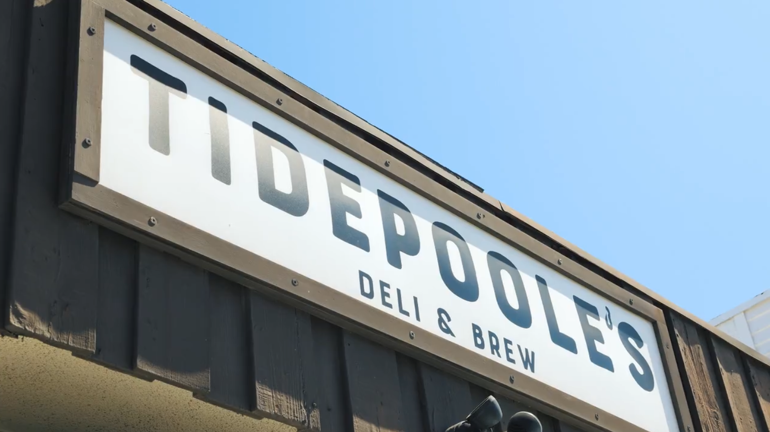
tidepoole’s
LOGO | VISUAL IDENTITY | PACKAGING
The client wanted a logo and visual identity that felt more fun and inviting—something that matched the laid-back, welcoming vibe of their coastal deli. Their restaurant serves up delicious sandwiches, pizza, wraps, burritos, salads, cold beer, and more, all just steps from the ocean. The branding was designed to reflect the casual energy of the space while standing out in a competitive food scene.

The logo features an apostrophe designed as a subtle hook, nodding to the restaurant’s connection to fishing, the ocean, and its seafood-inspired menu items. The illustration within the logo is an artistic take on the nearby tide pools, capturing the spirit of the deli’s coastal location. To give the name a unique twist, we incorporated an “E” into the spelling—playing off the client’s last name, Poole.